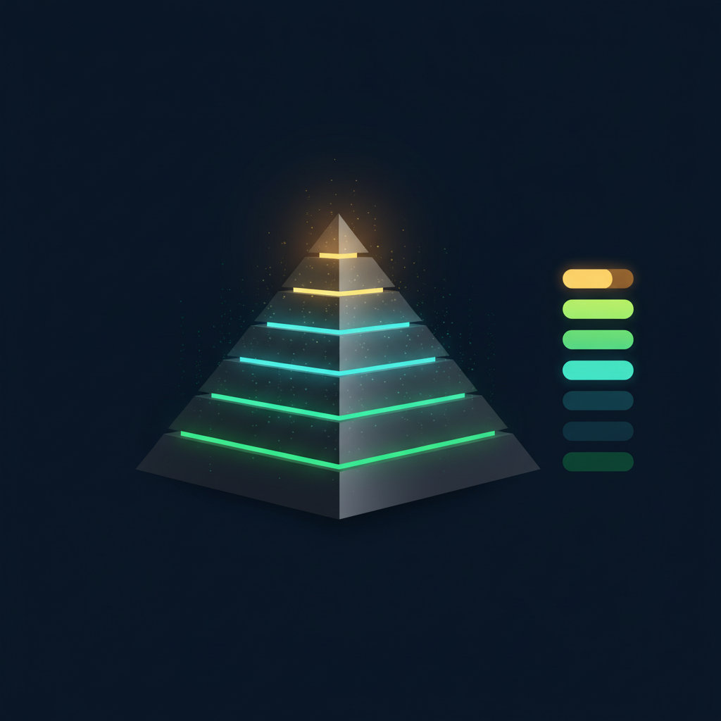
The Health Score is GearCheck's single-number summary of your panel. It runs from 0 to 100, and it is deliberately calibrated for an athletic context rather than a general-population one. But the number is only half the information. The tier it falls in tells you what kind of reading it is.
The recalibration from a median of 85 to 76 was not cosmetic. The old model scored prose, so a well-written report could inflate the number. The new model scores findings, which means a clean panel with a few explained deviations lands lower than you might expect. That is intentional: a score in the 70s is not a warning, it is a realistic baseline for someone on androgens. If you are used to seeing 90s from other platforms, do not chase that number. The tier is the signal, not the absolute value. A STRONG score at 78 is a different animal than a STRONG score at 95, and the movement between panels is what you should be watching.
Think of it like a car dashboard. The Health Score is a check-engine system, but one that knows you drive a race car. It does not just say something is off. It says how much of that is expected for what you are doing, and what is worth raising with a licensed medical professional or coach.
This guide breaks down the three tiers and what puts you in each one. More usefully, it explains why the direction your score is moving matters more than where it currently sits.
Direction beats absolute value in practice. A drop from 82 to 74 over two panels is more informative than a steady 70 if that 70 is your usual on-cycle baseline. The score is designed to be sensitive to change, so a five-point shift in either direction warrants a look at what moved. The tier change from STRONG to MODERATE is a bigger deal than a few points within the same tier. If you are in MODERATE and trending down, that is the time to review your protocol, not wait for the next panel. Conversely, a slow climb from 60 to 68 over three reports is a sign that whatever you changed is working.
What changed in July 2026
The scoring model was rebuilt around findings rather than scraped report text, and the tier system was simplified from five bands to three. Scores dropped across the board by design, with the median moving from roughly 85 to 76, because the old model was scoring the prose it had just written rather than the underlying data. If you have reports from before that date, do not compare their scores directly to newer ones. Compare within each era instead.
Markers sit inside their athletic-adjusted bands, and where they do not, the deviations carry context that explains them. Suppressed LH on exogenous testosterone, a raised hematocrit with normal blood pressure and normal platelets, an AST elevation alongside a high CK in a lifter — these are recognised as expected rather than penalised as damage. A STRONG score means the panel does not show a system under load. It does not mean nothing is happening; it means what is happening has a plausible, non-damaging explanation.
A 30-year-old on TRT at 120 mg/week. Lipids in range, hematocrit 0.51 with a 118/74 blood pressure, liver enzymes normal, total testosterone at the top of the TRT band. Two markers are technically outside standard lab ranges and both are contextualised.
What this is for: Confirming that your current setup is not producing measurable strain, and giving you a stable baseline to compare future panels against.
Several markers are drifting, or one is drifting meaningfully, and the context does not fully account for it. This is the most common tier among people running anything beyond replacement doses, and it is not an alarm. It is the band where the panel starts giving you something specific to talk about: which system is carrying the load, whether the drift is isolated or corroborated by neighbouring markers, and whether it is moving.
A 35-year-old on a 500 mg blast. HDL at 0.82 mmol/L, ApoB mildly raised, ALT 68 U/L with a normal GGT, hematocrit 0.55 with blood pressure at 132/84. The lipid picture has corroboration from two markers; the liver picture does not.
What this is for: Identifying which one or two systems are actually carrying load, so a consultation is about something concrete rather than a whole panel.
Multiple systems are showing load at the same time, or one marker sits far enough outside its band that context cannot explain it away. The model reserves this tier for patterns where markers corroborate each other — a lipid drift confirmed by ApoB and non-HDL together, a kidney signal confirmed by both eGFR and cystatin C, a hematocrit with blood pressure and platelets moving with it. A single dramatic number does not put you here. A pattern does.
A 32-year-old on a high-dose cycle. Hematocrit 0.58 with platelets at 480 and blood pressure at 148/94, HDL 0.46 mmol/L with ApoB clearly raised, ALT 120 U/L with GGT 65 U/L. Three separate systems, each with internal corroboration.
What this is for: Making the case, with specifics, that this panel deserves a conversation with a licensed medical professional sooner rather than at the next routine interval.
These tiers are not instructions
The score is built by aggregating the status of each marker. In 2026 those statuses were renamed to strip out clinical-directive language, so if you're looking at older reports the vocabulary will differ. The current set:
The label and the score now come from the same scale. They used to be computed separately, which let them contradict each other: an eGFR of 67.5 could read Review in the marker table while contributing almost nothing to the score. Wherever a marker has a clinical severity curve, its label is read off that curve, so a harsher word always means a heavier cost.
The old split between label and score created blind spots. An eGFR of 67.5 could read Review in the marker table while contributing almost nothing to the score, because the two were computed independently. That meant a panel could look alarming on paper but score fine, or look clean but score poorly. The current model ties them together: the label and the score come from the same severity curve. If a marker is flagged, it costs points. If it is Context, it is damped but not ignored. This removes the contradiction and makes the score a faithful summary of the findings. When you see a low score, you can trust that the markers underneath it are actually driving it.
Inside the athletic-adjusted band. Contributes full points.
The value sits just outside the band, a small drift that's still early.
This value sits measurably outside the reference band, so it's worth following across subsequent panels to see how it trends.
When a result is substantially outside the band, or when a contextual rule escalates it, that's a discussion topic.
Values that fall outside the band can still be explained by a rule. Muscle-origin AST, an eGFR artefact, and expected androgen effects all fit that pattern. The score damps them rather than removing them outright.
Suppressed LH on exogenous androgens is informative rather than risk-bearing, for instance, and it's also excluded from scoring.
How Context markers affect your score
A marker classified as Context is damped, not deleted. An eGFR of 72 in a strength athlete with a clean cystatin C is largely a creatinine artefact, not reduced kidney function. Scoring it as impairment would be scoring the measurement error. But an explanation is not a guarantee, so the marker keeps a fraction of its weight, and how large a fraction depends on how strong the explanation is: strong evidence leaves 30% of the severity standing, medium 45%, weak 65%. The same eGFR without any supporting context stays in the score at full weight as Monitor or Review. This is where most of the difference between GearCheck and a standard lab readout comes from.
The model used to remove them outright, and that quietly changed the meaning: "we have set this evidence aside" became "there is no evidence." A domain where every flagged marker was explained scored a perfect 100. A Context marker still counts fully towards your panel coverage. It was measured; we simply understand why it reads the way it does.
Certain markers carry more weight in the score than others. The model decides that weight based on how irreversible the damage is and how well the domain predicts hard outcomes. Three of them are worth understanding:
Weighting is not uniform. Kidneys and cardiovascular carry the most, so a 10% deviation in eGFR or a blood pressure of 135/85 costs more than a 10% deviation in ferritin. The model also uses a ramp, not a step: a marker just outside its band costs a little, a marker far outside costs a lot. For example, an eGFR of 75 (just below the athletic band) might cost 2 points, while an eGFR of 55 costs 15. HbA1c is even stricter: every 0.1% above 5.5% costs ten points, so a reading of 5.8% costs 30 points from the metabolic domain. That is why a single HbA1c can drop your score by several points even if everything else is clean.
Hematocrit
ApoB
Cystatin C
📈A stable 65 is better than a dropping 80. The single most important number is not the score itself — it is the direction the score is moving over time.
— GearCheck Health Score System
A single Health Score is just a snapshot. It shows you where you stand right now, nothing more. The real signal comes from stacking consecutive reports and watching how that number moves, because that tells you where you're headed. Here's how to read the movement:
What you're doing is holding, so the next panel is about confirmation, not correction. Keep the monitoring interval you have.
A steady score is not a reason to extend your monitoring interval. It is a reason to keep it. If you are on a stable protocol and your score has been within the same tier for three panels, the next panel is confirmation, not correction. But if you change something, like a dose, a compound, or a training block, test sooner than your usual interval. The score is sensitive to change, and a new variable can shift it within weeks. Also, do not compare a score from a fasted morning draw to one from an afternoon draw after a workout. Draw conditions matter, and a stable score under consistent conditions is the only kind worth trusting.
An early signal. Something shifted: a compound change, a dose change, a diet change, a stretch of poor sleep. Worth identifying before it compounds.
Before you panic over a low result, check the draw conditions first. Rest days, hydration and timing relative to a hard session can shift several markers at once and produce a drop that is not real. Only then look at what actually changed.
Draw conditions are the most common source of false drops. A hard leg day within 24 hours of the draw can elevate CK, AST, and even creatinine, which drags down the liver and kidney domains. Dehydration does the same to eGFR. If you see a drop, ask yourself: did I train yesterday? Did I drink enough water? Was this draw fasted and at the same time as my last one? If the answer to any of those is no, re-draw under better conditions before you change anything. A single bad draw can cost you 5-10 points and send you into a lower tier for no real reason. The score is only as good as the blood draw behind it.
Cycle phases usually need to be treated separately. When you're comparing bloodwork, match on-cycle results against previous on-cycle results, not against off-cycle baselines. The trend you see within each phase is the real signal.
Score Mechanics
The score starts at 100 and subtracts for each deviation, weighted by severity and by how much the affected domain predicts hard outcomes. Deviations ramp with distance from the band rather than stepping at a threshold, so a marker just outside its range costs far less than one well outside it. Corroboration multiplies: several markers in one organ system moving together cost more than the same number of isolated deviations, because concurrent signals mean more than scattered ones. Contextual markers are damped rather than deleted, and descriptive rows, including readings a body cannot physically produce, which are reporting errors rather than results, stay out of the calculation altogether. The result is that a 70 with one corroborated cardiovascular pattern is a very different report from a 70 with four scattered mild drifts, which is exactly why the tier alone is not the whole story.
Ten domains carry weight, in this order: kidneys and cardiovascular heaviest, then blood, liver and metabolic, then hormones, inflammation, thyroid, iron and vitamins. Your blood pressure is scored too, on a curve that starts at 120/80 and climbs steeply. And a panel that covers too little, meaning fewer than three domains, fewer than eight markers, or too little depth in the domains it did touch, is given no number at all rather than a flattering one.
Blood pressure is scored on its own curve, starting at 120/80. Every point above that costs, and the curve climbs steeply. A reading of 130/85 might cost 5 points, while 140/90 costs 15. That is because hypertension is a silent killer, and the model weights it heavily. Also, panel coverage matters: if you only have 8 of the 10 domains represented, the score is less reliable. The model requires a minimum of 8 markers across at least 3 domains to compute a score at all. If you are missing a domain, the score is still calculated but with a penalty for incomplete coverage. That is why a full panel is worth the extra cost.
Two markers are graded on their own ladder rather than by distance from a reference range, because their diagnostic thresholds sit only a few percent above it. HbA1c is the strictest: below 5.4% the metabolic domain scores full marks, and every further 0.1% costs ten points, reaching zero at 6.4%. It caps the domain rather than averaging into it. A clean fasting glucose is one morning, HbA1c is the last three months, and only one of those is hard to have a good day on.
Score Is Not a Diagnosis
Test Consistently
When you're pulling bloods, you want the comparison to mean something. That means testing at the same point in the cycle, under similar conditions, with similar rest days leading in. If you stack a mid-blast score against a cruise score, you're comparing two different physiological states and the numbers lose their signal. Two mid-blast scores, taken the same way, tell you far more about how your body is responding to that specific dose and compound.
Watch Trends, Not Snapshots
One drop might be noise, but three consecutive drops is a signal. Look for the pattern across 2 to 3 panels before drawing a conclusion.
Three consecutive drops is a signal, but the magnitude matters. A 3-point drop each panel is different from a 10-point drop. Look at the slope: a steady decline of 5 points per panel is more concerning than a one-time 15-point drop that stabilizes. Also, compare like for like. If you are on a blast, compare to your previous blast, not to your cruise. The score is phase-sensitive, and a drop from 80 on cruise to 70 on blast might be expected. The real signal is a drop within the same phase across multiple cycles. If your on-cycle scores are trending down cycle after cycle, that is worth a conversation with your licensed medical professional.
Read the Findings, Not Just the Number
The score is a summary of the findings underneath it. Those findings say which system is carrying load and what would confirm it, and that is the part worth taking to a consultation.